Lessons from the Making of Truist's Web Platforms
Envisioning a Unified Experience for a Complex Organization
Role: I lead ux design for the design system and I lead ux design for business banking.
Credits: Chris Detzi, Jia Lao, Dan Mauney, Scott Zimmerman, Caleb Furlough, Ali Rezajo, Tito Rivera, Miranda Capra, Joanna Dickson, Ginger Aycock, Jonah Miller — the entire DCAM collaborated in research, development, and content strategy
Methods: Design Strategy / Stakeholder Workshops / UX Design / Prototyping & Testing
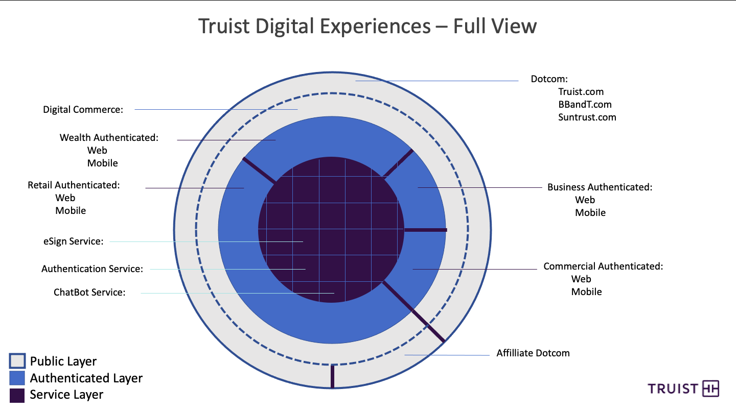
Truist was formed in 2019 by 2 banks, SunTrust and BB&T. It's currently the 6th largest bank in the United States. My teams designed the design system and experiences for consumer, business, credit card, lending and investing products in the Consumer and Business segments for Truist.
The Truist webspace was in dire need of an update once the merger was complete, so we started with a design system, then, built a new truist.com banking experience from the ground up.
The Design Approach
Research
Mobile-First
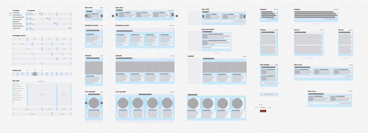
We designed for the mobile experience first, then scaled those designs up to larger browser widths. This caused us to question content and minimize the number of elements present on the screen at one time making for a more consumable experience regardless of device.
Prototyping
The design team then explored a number of variations before narrowing then we tested those concepts with users.
Accessibility
Throughout the development process, we prioritized accessibility by:
- Adhering to the Web Content Accessibility Guidelines (WCAG) 2.1, ensuring the website was usable by people with disabilities, including those with visual, auditory, motor, cognitive, and speech impairments.
- Conducting regular accessibility testing: We performed ongoing testing using automated tools and manual checks to identify and address accessibility issues.
- Involving users with disabilities: We included individuals with disabilities in the testing process to gain valuable feedback and ensure the website met their needs.
- Providing alternative text for images: We included descriptive alt text for all images to convey their meaning to screen reader users.
- Ensuring keyboard navigation: We made sure all interactive elements on the website were navigable and operable using only the keyboard.
- Providing sufficient color contrast: We used adequate color contrast between text and background to ensure readability for users with low vision.
- Creating clear and concise language: We used plain language and avoided jargon to make the website easy to understand for all users.
Regularly Scheduled Design Reviews and Critiques
In order to build upon your teammates' ideas, you need to hear them (especially in a remote team where you can't chance a glance at anyone's design.)
Good feedback is hard. We had intentional training and practice to get better at delivering and receiving feedback that inspired action.
Implementation and Documentation
Once we converged on one design, we were ready to build. The designs were then broken up, iterated upon in the browser, and integrated into our content management system. We created detailed documentation explaining the patterns and best practices so that partner organization could easily manage and keep their content up to date.
The Results
Visit the new Truist Bank Website